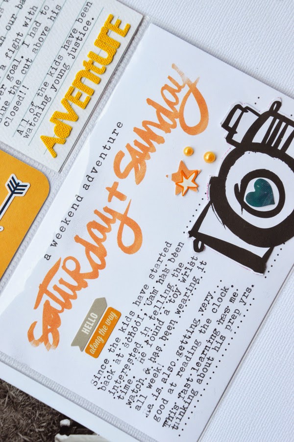
One thing that is constant with my PL pages, is that I take inspiration from my photos. This one is no different from the others and there is one photo in particular this week, that has sparked my colour run for the entire spread! I am just thankful that the rest of my photos don't clash too badly! *grin*
This week was a momentous one for my older two boys. After a few years of waiting for an opportunity to play an extracurricular sport, they finally commenced (and committed to) grass hockey. It was this photo of the two of them, testing out their mouth guards, that launched my colour inspiration for Week Nine - orange, black and a touch of blue.
As I looked through the rest of my photos, I noticed that they weren't that dissimilar in the colour range. Nothing that a strategically placed, typed quote couldn't fix!
And since the colour orange is often associated with the season Autumn, aren't I lucky I could take note of it during Week Nine!
As an extra bonus for my colour choice this week, I found a clothing tag that totally depicts the superhero craze my children are embracing. I simply trimmed the edges to fit the 3x4" pocket and backed it with a piece of Carta Bella patterned paper.
And it also helps that my youngest drew stripes on his face in orange pen! Everything this week was working in my favour to use orange as my base colour! LOL!
To balance the "orange" overload, I've added touches of blue. Where orange is on the warmer spectrum of the colour wheel, blue is definitely on the cooler side. The blue counteracts the boldness of the orange, in a subtle manner, allowing the eye to rest. In other words, you really shouldn't need to reach for your sunglasses!! *grin*


This is so awesome, love the colours! So vibrant and full of 'life' x
ReplyDeleteI always try to choose my papers in following the colors of my pictures. Not easy sometimes ! I think you success very well this exercise ! That's so amazing the orange color followed you all this week ! ;-) I really like how you mix the differents elements, and all those détails, hearts, stars and so on ... Thanks for sharing !!
ReplyDelete